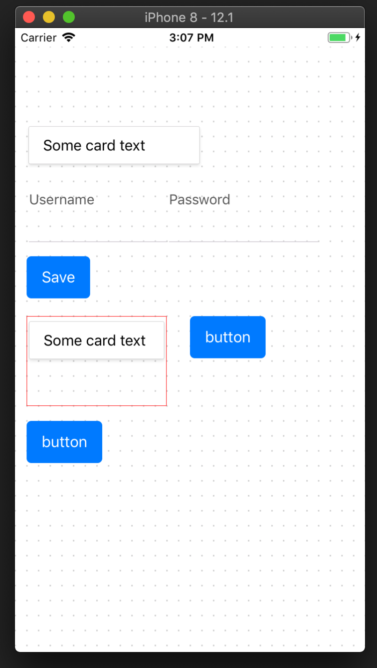
Sometimes, in the process of the work of mobile applications, it can become necessary to dynamically form pages or allow users to adjust these pages up to their needs. The examples are the dynamic creation of survey forms, adding extra fields at the registration stage (within the framework of B2B app), etc. In this article, I will explain how to develop such a mechanism and implement basic methods to manage existing components. This will let us manage the page outlook on an entry-level.
For a starting point of our editor, we take a standard approach. This approach is used in the majority of CAD systems or in applications that allow creating wireframes of the web pages.
So, with the help of regular “tap” and following dragging, we select an area on the screen where we want to place the new component. It can be an input box, just a draft of “dummy text” or any other component.
After that, we choose the needed element from the app components library and, if necessary, adjust its size. In the end, we receive JSON configuration with new page parameters.
But enough with theory, let’s write the code.
The Grid Formation
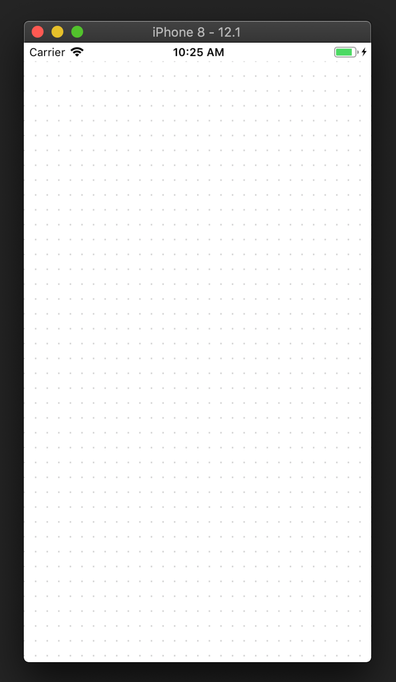
For the convenient work with the form, first of all, we need a grid, which can be found in every editor. This grid lets to place components more accurately on the page and helps not to waste time on the element manual positioning. Let’s try to implement something like this.

Firstly, we need to create a component to be the wrapper for all components of the page: src/pages/Home/components/PageWrap. It will also serve as a place where all events will be handled (interaction between user and components).
Make panResponder available and add our events

this.panResponder = PanResponder.create({
    // Ask to be the responder:
    onStartShouldSetPanResponder: (e, gestureState) =>
        !!gestureState.dx || !!gestureState.dy,
    onStartShouldSetPanResponderCapture: () => false,
    onMoveShouldSetPanResponderCapture: () => false,
    onMoveShouldSetPanResponder: (e, gestureState) =>
        !!gestureState.dx || !!gestureState.dy,
    onPanResponderGrant: (evt, gestureState) => {
        if (events.listenerCount(EVENT_MOVE_BEGIN)) {
            events.emit(EVENT_MOVE_BEGIN, gestureState)
        } else {
            events.emit(EVENT_MOVE_NEW, gestureState)
        }
    },
    onPanResponderMove: (evt, gestureState) => {
        events.emit(EVENT_MOVE, gestureState)
    },
    onPanResponderRelease: (evt, gestureState) => {
        events.emit(EVENT_MOVE_END, gestureState)
    },
    onPanResponderTerminationRequest: () => false,
    onShouldBlockNativeResponder: () => false,
})
For a proper drawing of the grid, we need to know the parameters of the page we are working with beforehand. Responsible for it is a handler: handleLayout src/pages/Home/components/PageWrap.js:51
Then we can create the grid component: src/pages/Home/components/GridComponent.js
Form the grid

<Svg height={height} width={width}>
    {_.range(0, height, grid.height).map((h) => (
        <Line
            x1={0}
            y1={h}
            x2={width}
            y2={h}
            key={`line_${h}_${width}`}
            stroke="rgba(0, 0, 0, 0.2)"
            strokeWidth={1.6}
            strokeDasharray={`${pointSize} ${unitWidth - pointSize}`}
            strokeDashoffset={0.4}
        />
    ))}
</Svg>
As a foundation, we use a hurriedly generated SVG picture. To make the form look beautiful, we need to make a flexible grid that depends on our own conditional units instead of screen pixels. It allows making the page readable independently of screen proportions or its positioning.
HOC src/pages/Home/components/GridComponent.js is responsible for the attachment of the elements to the grid and transformation of coordinates from pixels to our conditional units. It serves as a wrapper of all page elements and performs their positioning.
Interaction With the Elements
Now let’s work on the functions of interaction with our elements. As said before, we need to be able to change the sizes of elements and their disposition on the screen.
For this interaction we use PanResponder. This is an event handler that allows us to track the interaction between users and elements on the screen. We need it not only for the elements but for the whole page. As at the very beginning of element creation (first click on the form’s empty space), the element itself doesn’t exist.
So set panResponder against the whole page, or more specifically, against the wrapped component: src/pages/Home/components/PageWrap.js:22.
The handling of elements interaction is realized in the same way as it is usually done in browsers. That is through the events system. Actually, it is possible to realize it by standard React capabilities, when we implement OnClick function for every element and also for the wrapper element. Still, I am more keen to use the approach with the events’ system. It seems easier and eventually initiates a smaller number of render events.
Now, it’s time for interactions. While initiating the PanResponder, we should instantly assign to its events onPanResponderGrant, onPanResponderMove, onPanResponderRelease. An attentive reader could ask why I missed onPanResponderTerminate. I did it on purpose, as now we are working on the conception and can neglect a few other additional aspects.
In its turn, with the help of eventEmiter, onclick events generate our custom events. And existing elements on the page react to these particular custom events.
Every element of the page has 2 phases: phase of calmness and phase of the interaction. It helps to assign all elements to our events only when it’s necessary, and avoid their simultaneous interaction.
To implement such type of actions with a minimum number of code changes, we add one more wrapping component: src/pages/Home/components/ComponentContainer.js. Its function is to realize assigning to events and interaction with users.
Get attached to the mouse events

onListeningBegin = () => {
    const { events } = this.props
    events.addListener(EVENT_MOVE, this.onMove)
    events.addListener(EVENT_MOVE_END, this.onMoveEnd)
}
This new component is a container where we place our main component from the list of our components and also the component which changes the phase while choosing (in our case it’s “tap” on the element): src/pages/Home/components/ComponentContainer.js:118. There is also a range of additional marker components that appear only at the interaction phase and are used for convenient dragging/changing the main component sizes.
Figure coordinates to display the grid

getNewPosition = (dx, dy) => {
    if (this.interactionType === 'left') {
        if (dx < this.style.width) {
            return { left: this.style.left + dx, width: this.style.width - dx }
        }
    } else if (this.interactionType === 'right') {
        if (this.style.width + dx > 0) {
            return { width: this.style.width + dx }
        }
    } else if (this.interactionType === 'top') {
        if (dy < this.style.height) {
            return { top: this.style.top + dy, height: this.style.height - dy }
        }
    } else if (this.interactionType === 'bottom') {
        if (this.style.height + dy > 0) {
            return { height: this.style.height + dy }
        }
    } else if (this.interactionType === 'center') {
        return { top: this.style.top + dy, left: this.style.left + dx }
    }

    return null
}
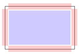
For example, let’s take a look at the abstract element. It can be a button, field, etc. In the editing mode, it has to have zones that react to our events: 4 elements that handle the size changes while dragging beyond the component’s rims and 1 central element that is responsible for transposition.
Schematically it looks like this:

Element and interaction zones look like this

<React.Fragment>
    <InteractionMarket type="center" onPress={this.handleInteract} />
    <InteractionMarket type="left" onPress={this.handleInteract} />
    <InteractionMarket type="right" onPress={this.handleInteract} />
    <InteractionMarket type="top" onPress={this.handleInteract} />
    <InteractionMarket type="bottom" onPress={this.handleInteract} />
</React.Fragment>
Black square shows object outlines, blue and red zones handle the interaction: src/pages/Home/components/InteractionMarket.js
Creation of a New Element
To implement the creation of a new component we need to make a new additional cap component. This cap component is needed to define the location area for a new component and to choose the type of the component from our library: src/pages/Home/components/CapComponent.js
When the interaction between the user and this element is finished, the modal window is called. In our case, these are a few basic elements from the React-native-base library: src/pages/ModalComponentsSelector/index.js
After choosing the component, the mechanism of adding new element is called from the wrapped component: src/pages/Home/components/PageWrap.js:83
Therefore the configuration of a new component is added to the state and page rebuilding with new components takes place.

This is the end of the main part of the conception of the dynamic page building. Received configuration can be sent to the server for future processing. Or, as in our case, saved in localStorage for descriptive reasons.
If you find the article useful, I will continue the topic and describe how to change settings of previously created components.


