


Styling of the mobile app may be tricky – there are a lot of screens sizes and screen ratios, especially for Android devices. When you develop an app, in most cases you have only one wireframe version in Invision/Sketch per platform. For example in our last project, we targeted iOS only and had wireframes for iPhone X and iPhone 8 only. Suddenly the client decided to support iPhone 8 Plus, 6, 6 Plus, XS, XR. This year we will see the new iPhone with different screen size and dimension. I’m sure it will be a new requirement. If we just hardcoded in the original design for iPhone X, it would cause us big troubles just before project launch.
How to create a responsive react-native app from a mockup?

Step 1: Move from physical to density independent pixels
According to docs:
All dimensions in React Native are unitless, and represent density-independent pixels (wiki).
Any mockup is designed with physical pixels. So we need to convert pixels to density independent pixels.
We calculate relative width and height for the current screen size.
export const deviceWidth = Dimensions.get('window').width
export const deviceHeight = Dimensions.get('window').height
export const calcHeight = x => PixelRatio.roundToNearestPixel((deviceHeight * x) / 100)
export const calcWidth = x => PixelRatio.roundToNearestPixel((deviceWidth * x) / 100)
We avoid using ANY hardcoded constants in the layout. It’s very tempting to use +10 px to align space between to controls. But if we do this and somebody will run the app on a device with another screen density/ratio this single line will make a lot of trouble for us.
headerText: {
  ...textHeaderStyle,
  paddingTop: calcHeight(4),
  paddingLeft: calcWidth(16.5),
  paddingRight: calcWidth(16.5),
  textAlign: 'center',
  lineHeight: 17
}
Step 2: Use different styles/const in React-Native for different device models

In our experience, we got a situation when responsive styles work great for all devices. But there are devices with much wider screens (iPhone X vs iPhone iPad) have much different aspect ratio. In this situation, responsive styles will be not enough.
Our responsive helpers use a linear function to the width or height of the device. Linear responsiveness is not a universal instrument ’cause if you start using it for fonts or borders/paddings, you will see how ugly can be the design of your app. The main use of linear responsive helpers is a layout, like columns width, sidebars or items grid.
import { Dimensions, Platform } from 'react-native'

export const isIphoneX = () => {
  const dimen = Dimensions.get('window')
  return (
    Platform.OS === 'ios' && !Platform.isPad && !Platform.isTVOS &&
    (dimen.height === 812 || dimen.width === 812 || (dimen.height === 896 || dimen.width === 896))
  )
}
This is our helper function to ensure, the current device is iPhone X. Now when we know this, let’s apply the appropriate style:
const style = isPhoneX() ? style1 : style2Step 3: Different layouts for smartphones and tablets, portrait and landscape mode
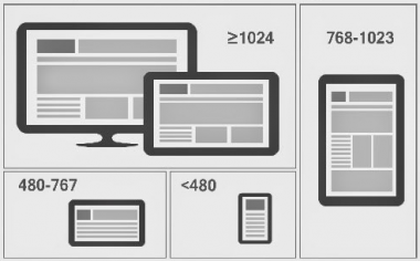
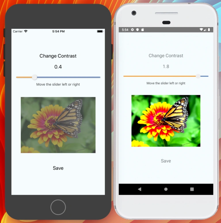
Are you working on the app that also may be launched on the tablet, start from UX for it. How do you want to rebuild the app interface for the much wider screen? What controls do you want to put on free space? What controls/components you need to remove if the screen is much narrower?
Discuss it with the client as soon as possible to avoid spending time on reworking functional screens. Make sure you have approved mockup before working on styles.
Step 4: Pictures
To get astonishing image quality on React-Native and in the same time save internet traffic, we need to ask backend for image size for specific mobile app screen size. For sure while image is loading we will show spinner.
So now we need to do vice versa – convert density-independent pixels that we have in image style to physical pixels, that backend works with. In BeatyAdvisor project we use Cloudinary for easily image processing It allows to resize image using single param in URL. To calculate it there is built-in helper:
const imgWidthDP = 68
const imgWidth = PixelRatio.getPixelSizeForLayoutSize(imgWidthPx)
